I recently wrapped the summer semester of my graduate program, which was a class in Information Design. Although my undergraduate degree included a specialization in editing and graphic design, it had been a while since I had designed at this level and I was happy to receive a refresher and learn new tips and tricks.
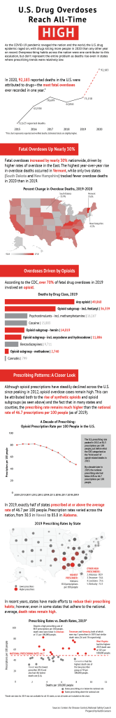
For our final project, we were tasked with creating an infographic that told a story and contained at least four distinct charts. Inspired by a story I heard on NPR about nationwide drug overdoses, I created the following infographic (also linked here – please click on link and click infographic once to enlarge).
I learned a lot from this semester and from this project. I am now much more confident using Adobe Illustrator, and I learned how to create map charts in Google Sheets. I enjoyed this project and am now a much more educated reader of infographics. I look forward to the opportunity to apply these new skills to my future work!
I created this video for the summer residency of my master’s program, in which we had to film and edit a video on Adobe Premiere Pro in one week. This video was shot entirely on an iPhone. The assignment was to create a video inspired by a poem. I chose “I Worried” by Mary Oliver.
I have been admittedly absent from this page for a while–first, I was swamped with media relations work related to impactful COVID-19 research conducted by my institute, and then, we immediately launched into a year-long campaign to mark the institute’s 25-year anniversary. Add schoolwork to these responsibilities, and I have let my personal portfolio languish.
However, I am learning and producing so much cool stuff in my graduate program that I hope to revive this blog space so I can share some projects that are outside of my normal wheelhouse. It’s great to feel my skill set expanding in real time.
First, I wanted to reflect on what we’ve done so far for the campaign I mentioned above. It’s been a whirlwind, but it has also been a lot of fun and has taught me a lot about the history of where I work. Here are the broad phases this campaign has undergone, and my contributions to each.
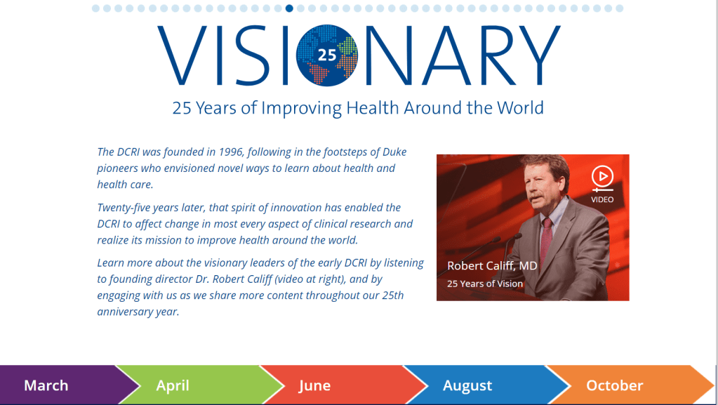
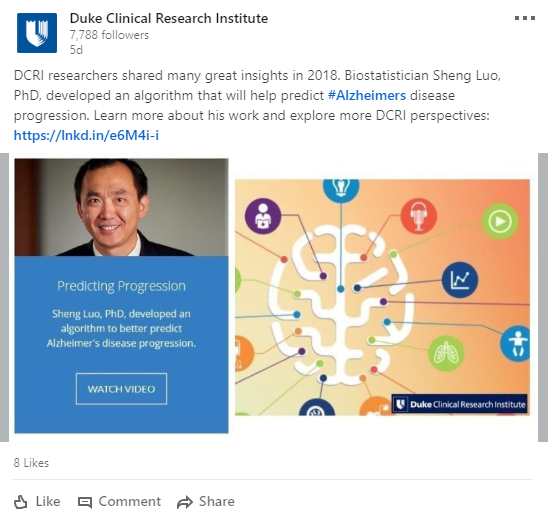
A screen capture of the beginning of the campaign’s homepage, which links to a new content release every few months.
Ideation/Strategy Setting/Concept Development. When my small team of three initially sat down to brainstorm, it felt as if we faced a herculean task–to come up with a communications plan to celebrate 25 years of the DCRI. I felt strongly that we needed a solid foundation to tie this campaign to in an effort to narrow our focus, and I put forth the idea that we align the campaign content with the institute’s new vision statement. After meetings with both internal and external stakeholders, this idea was accepted and we began to plan in earnest.
Content Development. Our campaign consists of five major content releases phased every two months throughout the year, which meant a lot of upfront planning to ensure there was no overlap and that every corner of the institute was fairly and equally represented. This also required a lot of input from both internal and external stakeholders, and we had to be fairly adaptable as plans shifted (sometimes mid-campaign, once we’d already started on execution).
Execution. Our campaign is centered on video content, and I am tasked with the execution of these videos. which I love because I get to interview a lot of interesting people and hear their perspectives directly. However, execution of this was complicated by the COVID-19 pandemic. So far, all of our videos have been recorded via Zoom, which has required a whole new set of learnings regarding lighting, audio, editing, etc. While not an ideal setup, we’ve still produced some really impactful and inspiring content. I work closely with our video editor, providing him the storyboard and time codes to tell a story that will resonate. Side note: While working on this campaign, I had the opportunity to learn Adobe Premiere Pro in school, which gave me an entirely new respect for how quickly and efficiently he works!
Dissemination. As the manager of DCRI’s social media channels, I am also responsible for creating and scheduling social media packages to accompany each content release. These packages include video snippets, impactful quotes, and social media graphics that a colleague helps me to design. In keeping with our theme of “Visionary: 25 Years of Improving Health Around the World,” I developed the hashtag #25YearsOfVision, which is now used for this campaign across Twitter, LinkedIn, and Facebook.
Analysis–and Adaptation. While I do keep an eye on our day-to-day social analytics, I don’t have a formal analysis capacity in my current role. My colleagues report back to me, and we respond as necessary by tweaking our strategy. For example, we recently found that the videos were performing much better in their shorter forms on social media than they were on the campaign landing page. Because of this, we will change the format of the next content release to mirror shorter, more digestible video content.
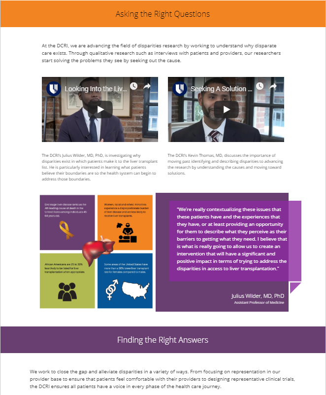
In conjunction with National Minority Health Month in April, we launched a campaign showcasing work from DCRI faculty in health disparities and in enhancement of minority health. Minority Health Month typically focuses on racial and ethnic minorities, but at the DCRI, we expanded our definition to include all populations historically underrepresented in clinical research–including women.
The preparation for this campaign looked much like other campaigns we have ran–first, I looked for existing content we could repurpose, and then I thought about new content creation opportunities. Fortunately we had created a ton of good content recently, especially on the multimedia side. This campaign was video-heavy, which I was excited about, especially because our last campaign, which was about a similar topic, had no video. For the purposes of this campaign, I only had to create one new video, while my colleagues created some graphics to accompany existing pieces of content.
I had fun writing the narrative for this campaign because I had to think about all the different ways the DCRI is addressing the problem and find examples of each. Finding connections between content always feels like solving a puzzle.
We decided not to send an email associated with this campaign, but I did create a social kit to drive traffic to the landing page. Here is an example:
And here’s a look at part of the page (you can see the rest here):
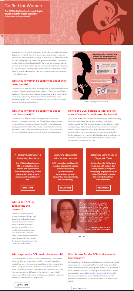
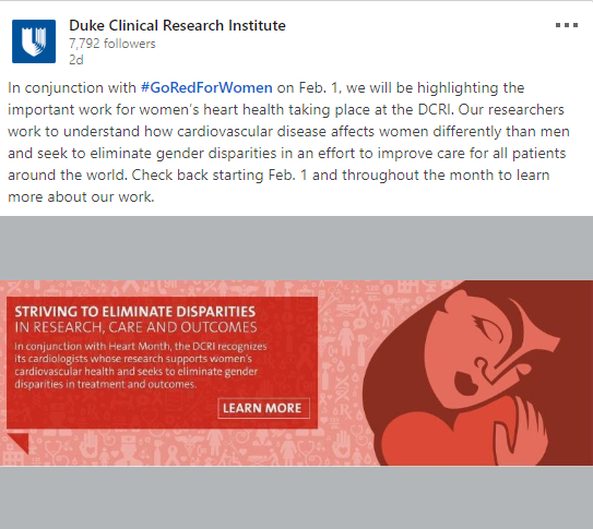
Today, we launched a campaign I have been working on for weeks in conjunction with the nationally recognized Heart Month and Go Red for Women, an American Heart Association-led initiative to raise awareness for women’s cardiovascular health.
This campaign involved gathering existing content associated with our theme–women’s heart health–as well as creating new campaign assets such as a banner image, graphic cards for social media, and an infographic. While I had an amazing graphics team to help me with these components, my role involved project management and thinking through all the moving parts.
Here’s a look at the entire page:
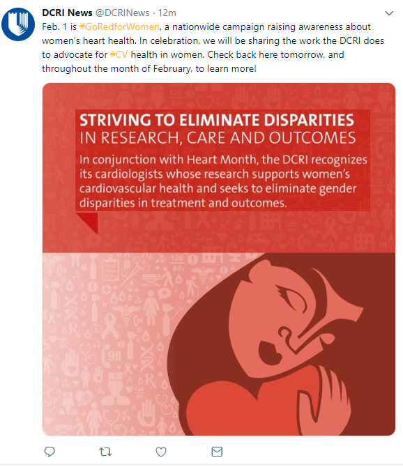
Even before the campaign launched, we worked on drumming up interest on our social channels with preview social posts that looked like this:
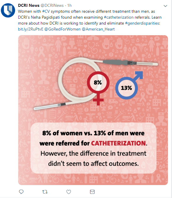
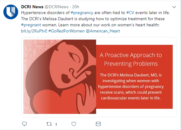
Then today, which was both the American Heart Association’s National Wear Red Day and campaign launch day, we sent out an email to more than 7,000 recipients to drive traffic to the campaign landing page. We will also be rolling out various kinds of social posts all month using content from the page.
I received tons of supportive feedback from both my colleagues and our faculty who was featured on the page. I will be monitoring the campaign throughout the month, tweaking social posts based on performance, and looking forward to the day when we can collect final metrics on it!
I recently led and launched a new initiative at my brand-new full-time job: a multimedia content repository where all of our videos, podcasts, graphics, etc. could live in one place.
This was envisioned as being a serendipitous experience for the user: He or she could click around and find different types of content about different topic areas. The project also sought to meet one of our organization’s goals of giving all of our therapeutic areas equal play in featured content.
This was a particular challenge for me, as I was tasked with building a “pilot” of the feature as a year-in-review project. I’d been on the job a little over a month, so I wasn’t involved in creating much of the content that would need to be featured.
That’s right: It was time for a content deep-dive.
After much trawling through our website, YouTube channel, and support from my colleagues, we came up with a robust list of 50+ pieces of content that we could reasonably see including in the project.
We know we would need to narrow this for the pilot–so it was time for some tough decisions, keeping variation in type of content at top of mind, as well as giving all of our therapeutic areas equal love!
I then wrote teasers for each piece of content and inserted them into some fun, colorful blocks built by our design team. I narrowed my focus to interesting facts, statistics, quotes, or questions that would pique the user’s interest and get him or her to click through to learn more.
I paired this with posts for our social channels to drive traffic to the new page and to get people on their way to learning more about our organization’s insights!
This is an evolving project–in the future, we hope to implement a function that sorts the content so we can add all new content without the risk of subjecting our users to an endless scroll. It will also be a long process of metrics-gathering so we can judge which content is performing well, and perhaps feature more of that type of content (or create more, which I really look forward to) in the future.
In the meantime, I’m really glad that I had the opportunity to work on this project. It was a great way for me, as a new employee, to quickly familiarize myself with our content and the stakeholders in our organization. It also reassured me that I’d joined a team of supportive, creative folks who are always willing to lend a hand (or actually stay until 5 p.m. the day before leaving for a two-week cruise just to help see the project through).
The team that worked on this also received great feedback from other team members. One of my favorites:
“I know getting this new page out of the gate was a herculean effort, but wow does it look good. You would never know the hurdles you crossed, or the functionality you had hoped it would have included. It looks damn good as is and provides a solid framework for future iterations. Really nice work to everyone involved.”
During my time working at Duke’s Fuqua School of Business, I contributed to many of their drip email campaigns for various degree and non-degree programs. My favorite project was for a brand-new program called Master of Quantitative Management: Business Analytics.
For this email campaign, I needed to stand up a suite of emails quickly, from scratch. While we had templates I was expected to work within, I had a bit more flexibility with topics we should cover. During the content gathering and content creation phase–one of my favorite parts of any project–I met with many students, faculty, and staff to learn more about the amazing stories we should be telling about the program.